Fave CPG Package Designs: A Veteran’s Take on Iconic Packaging

Hi, I’m Jenny—a CPG entrepreneur who’s launched multiple successful food and beverage brands and consulted for dozens more. If there’s one thing I’ve learned over the years, it’s this: great packaging isn’t just about looking pretty. It’s about telling a story, capturing attention, and closing the sale—all in under three seconds.
In this article, I’m going to walk you through my favorite CPG package designs—some iconic, some indie, some new, and some vintage—but all effective. These are designs that have stood out on crowded shelves, sparked consumer love, and in some cases, helped define entire categories.
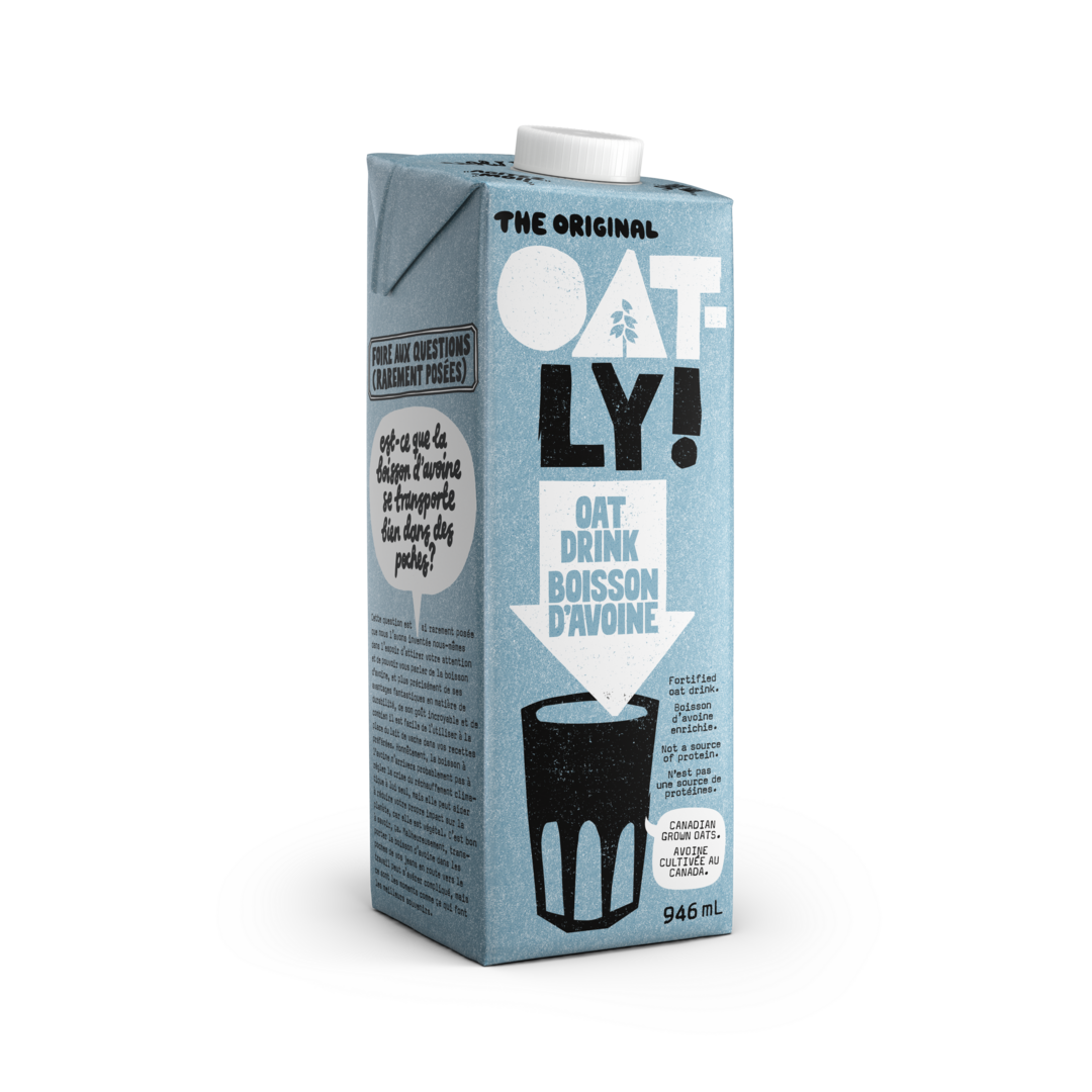
Oatly Oat Milk
Oatly broke the mold with its typography-driven carton that screams Scandinavian minimalism. Its tongue-in-cheek copy and bold sans-serif fonts turned oat milk into a cultural movement.
- Highly legible, monochrome-first design
- Brand voice conveyed through packaging copy
- Consistent brand identity across SKUs
- Disrupted the dairy alt market visually
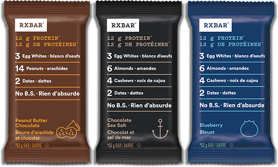
RXBar
With its radically honest front-of-pack design—listing ingredients right on the front—RXBar created a whole new playbook for clean labeling and minimalist packaging in protein bars.
- Radical transparency as core design motif
- Flat lay text layout draws quick attention
- Color-coded flavors for shelf clarity
- Functional meets aspirational

Milk Bar
Christina Tosi’s Milk Bar branding leans heavily on playful nostalgia, retro typography, and mouthwatering photography—perfectly capturing the joy of indulgent desserts.
- Retro-modern vibe with candy-shop flair
- Bright pink brand anchor color
- Highly Instagrammable look
- Reflects fun, experimental product ethos

LesserEvil
The packaging for LesserEvil snacks strikes a balance between wholesome and premium, with charming Buddha cartoon illustrations and calming pastel palettes.
- Soft-touch matte finish feels luxe
- Minimalist front with peaceful iconography
- Evokes mindfulness and health
- Color use is thematic and soothing
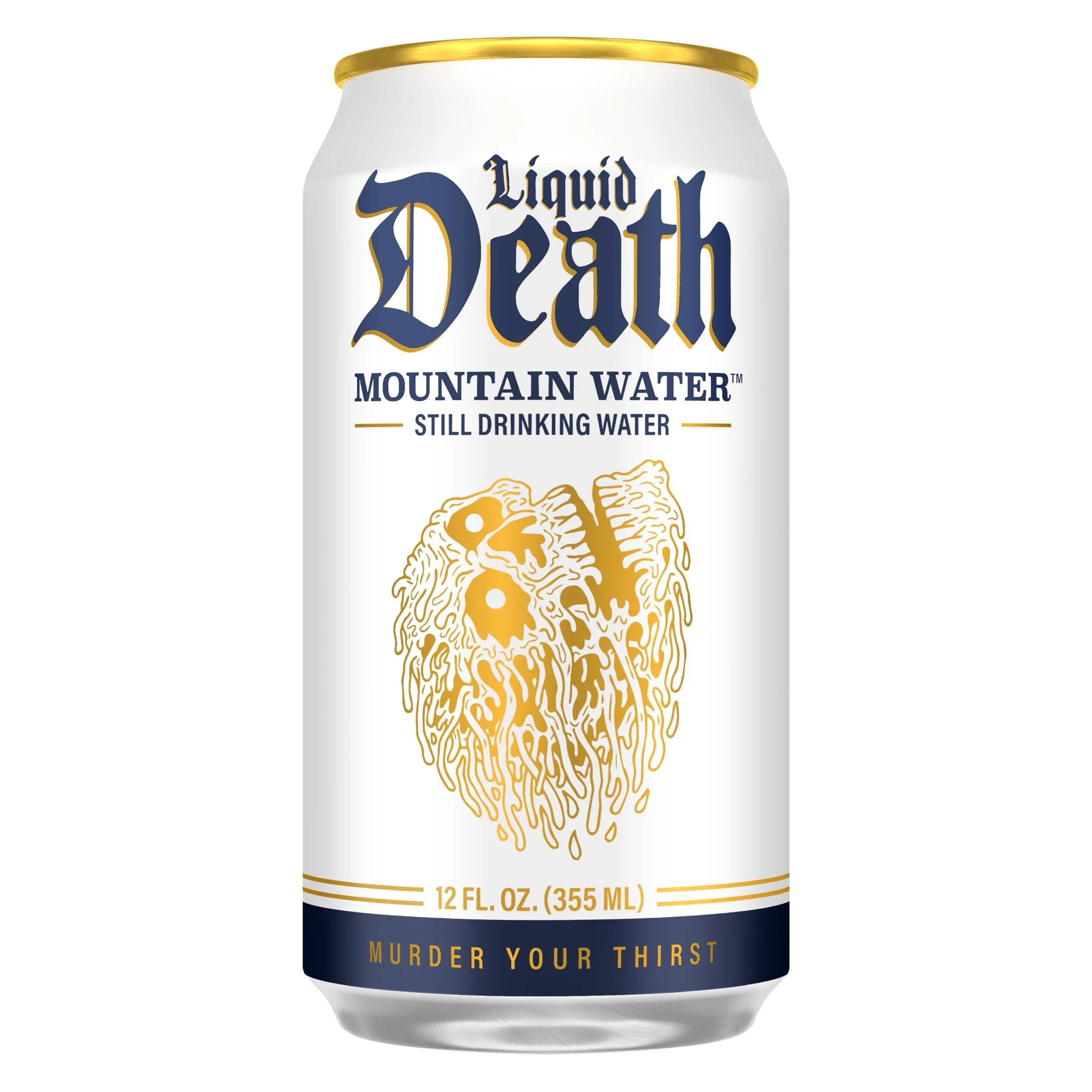
Liquid Death
This water brand flipped the category upside down with a heavy-metal aesthetic. Liquid Death’s tallboy cans and death-metal branding are instantly recognizable and fiercely different.
- Shock-and-awe factor in the water aisle
- Black and gold colorway breaks convention
- Humorous, irreverent tone
- Subculture appeal drives virality
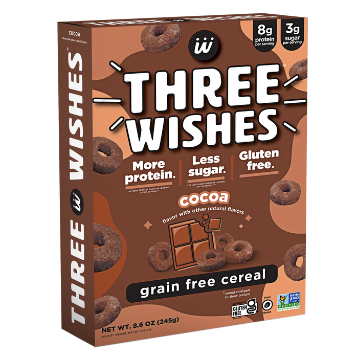
Three Wishes Cereal
Three Wishes brings a clean, modern vibe to the cereal aisle—where legacy brands dominate with busyness and primary colors. It’s grown-up cereal for ingredient-conscious millennials.
- Neutral tones with bold block text
- Stark contrast from category norms
- Healthy ingredients front and center
- Design appeals to modern households

Spindrift
Spindrift stands out in the crowded sparkling water space by highlighting its use of real fruit. The packaging is bright, honest, and refreshing—like the product inside.
- Illustrated fruit = immediate flavor recognition
- Clean, airy design speaks to purity
- Color accents for each flavor
- Effective use of white space

Clio Snacks
Clio’s yogurt bars look like indulgent candy bars, and that’s by design. The foil-wrapped look combined with rich jewel tones makes these a standout in refrigerated snacks.
- Unexpected indulgence in a healthy format
- Luxury look meets grab-and-go convenience
- Glossy, colorful, and compact
- Appeals to impulse buyers
Conclusion
Great packaging is part art, part science—and a whole lot of psychology. Whether it’s a rebellious tallboy can of water or a pink dessert box that evokes childhood, the best CPG packaging designs all have one thing in common: they make you feel something.
Each of the brands above has taught me something about the power of packaging, and I’ve borrowed cues from them in nearly every launch I’ve done. I hope they inspire you too—whether you're an early-stage founder, a designer, or just a curious shopper looking to understand why some packages pop.


Recent Articles:


Jenny is a friendly packaging designer who knows how to create packaging that retailers love, consumers notice, and regulators approve.
Questions you can ask me:
- What needs to go on my label?
- Should I use a pouch, bottle, or jar?
- What makes packaging stand out on a shelf?